


Updated: Jun 15
A well- organized website navigation serves as a roadmap that guides users effortlessly through the site. It simplifies the user experience, allowing visitors to find what they’re looking for without getting bored or frustrated through the process, which could lead them to leave the site. Website navigation keeps users engaged and makes them more loyal to the brand. This would guarantee repeat visits and encourage them to recommend the website to other users.
Good navigation is crucial for SEO, it makes it easier for search engines to understand the site’s structure, which consequently improves the ranking in search results. In this copy, we’ll explore the golden rule of website navigation, along with actionable and practical tips to ensure your website is smooth, effortless, and designed for long-term success.
Table of Contents:
What is Website Navigation?
Website navigation refers to the system that helps users move through your site effortlessly; a well-structured navigation system boosts engagement, lowers bounce rates, and improves SEO.
Here are four primary types of website navigation:
Primary Menu:
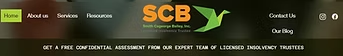
The primary menu is typically located at the top of the page and is designed to be simple and straightforward. It doesn’t contain too many menu bars, making it easier for users to understand the structure of the website and navigate effortlessly. This menu allows users to easily access key pages like Home, Products, Contact Us, About Us, and Services pages without getting overwhelmed. An example of a well structure header can be seen on one of our clients’ website:
Footer Navigation:
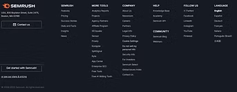
The footer navigation includes useful links and makes it easy for users to navigate the website when they scroll through it. It enhances the user experience by providing additional information, making the site more user-friendly, ensuring that important links are always accessible at the bottom of the page. Here’s an example of a well-structured footer:
The key elements that make a footer easily accessible and optimized are:
A clear CTA button such as “Contact Us”, “Book an Appointment”, etc.
Business logo and social media icons
Links to all important pages including about us, service pages, and other resources.
Business information such as location, service areas, hours of operation, phone number, fax, and email address, and a map (if applicable).
An updated copyright notice such as “© 2025 {company’s name}. All rights reserved.”, along with links to privacy policy and terms of service.
Sidebar Navigation:
Sidebar navigation is commonly used on websites with extensive content, where the header doesn’t have enough space. It’s particularly used on blog pages with different categories, and allows users to easily discover and explore various types of content by organizing it into easy-to-navigate sections.
Our suggestions for optimizing sidebar navigation include the following:
Both leftside and rightside navigation can be added on pages simultaneously. However, it’s best to use sidebar navigation only on informative pages. Using it on every page on the website including service pages, may overwhelm users and make it harder for them to stay focused and navigate through effectively.
Adding service pages links to blogs or other informative pages can be helpful to promote services and add more information on the page as to what business offers in relation to the blog content.
For example, if you are a dentist and your blog covers the difference between root canal and tooth extraction, you can include links to the appointment booking page as well as the root canal and tooth extraction service pages. This would help users take action from the blog article directly without wasting time looking for the right link in the header.
Freeze the sidebar navigation for a better user experience. Since blogs are designed to be lengthy, freezing the sidebar allows readers to access navigation links or promotions as they scroll through the page.
Prioritize key pages by limiting the number of links in the sidebar. Only include relevant pages that are important for conversion and make it easier for users to navigate easily through your marketing funnel.
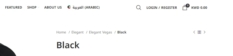
Breadcrumb Navigation:
Breadcrumbs show users the path they’ve taken through the site, like a trail. They help users understand their location on the website and make it easy to backtrack to previous pages. This type of navigation is notably useful on larger websites with deep content structures, like e-commerce sites or blogs, as it enhances usability and prevents users from feeling lost through the navigation process.
Key Guidelines of Website Navigation for an Optimal User Experience
Here are some practical tips to improve navigation on your website, keeping it simple, effective and user friendly:
Keep the Navigation Simple
If users have to think too much, your navigation isn’t working. Overcomplicated menus, quirky labels, or too many choices confuse visitors. Stick to these principles instead:
Keep menu items (main categories) to a minimum (5-7 essential links).
Use familiar terms (e.g., “Shop” instead of “Browse Our Offerings”).
Prioritize clarity over creativity – simplicity is key!
Use Descriptive Labels
Ensure that the labels in your navigation menu are clear, brief and direct. Avoid using vague or confusing terms; instead of using words like “Discover,” choose more specific options such as “Products” or “Services.” This helps users understand exactly where each link will take them, improving their overall experience.
Some of our suggestions are:
Follow the 3-click rule – users should find any page in three clicks or less.
Place important pages above the fold for immediate and easy access.
Use clear categories & subcategories to guide users.
The “Thumb-Friendly” Rule: Design for Mobile First
As of early 2025, mobile devices account for approximately 63% of global web page requests, indicating that a significant majority of internet users access content via mobile platforms. It’s crucial to focus on mobile friendliness, as not all users access websites through laptops. Many users visit websites on their phones, so it’s vital to make the design responsive to different screen sizes and formats. Typically, users access the menu on mobile through a hamburger menu, which allows them to navigate the website easily.
Use Breadcrumbs to Guide the Way
Having breadcrumb trails is a better option for websites with large amounts of content, such as e-commerce sites with many products or blogs with different categories, as it helps users find what they are searching for, quickly and efficiently.
Always use breadcrumbs on eCommerce, blogs, and large sites.
Keep it clear and simple (e.g., Home > Shop > Shoes > Running Shoes).
Make Your CTAs Shine
Your main call-to-action (CTA) should be visible at the top navigation, header and footer. On your website homepage, CTAs should appear at least three times in relevant places. Here are our suggestions to use CTAs effectively:
Use a bold, contrasting color to make it stand out.
Opt for clear, action-driven wording (e.g., “Get a Free Demo” instead of “Learn More”).
Position CTAs in high-traffic areas, such as the top-right corner of the menu.
Stay Ahead of Trends and Technology
Your website’s navigation needs to evolve with changes in technology and user behavior. These features are not essential for small or local businesses, but consider adding the following features (if they provide a good user experience) to stay competitive and relevant:
Voice Search: If you run an online store for clothing, makeup, or other products, voice search can offer a hands-free and efficient way for users to browse.
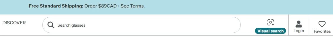
Visual Search: Enable visual search options for users to upload images and find similar products, especially helpful for fashion, beauty, or home decor sites.
Search Bar: If you run an eCommerce store, a prominent search bar in the header is essential, it helps users find what they need fast and boosts conversions.
Is Your Website Navigation Effortless for Visitors?
Challenge: Pick a few people who are unfamiliar with your website, ask them to complete an action, like signing up for a newsletter or finding a product category. Did they complete it without frustration?
If navigation issues are holding your users back, we will need to consider ways to make your site more intuitive and effective for conversions.

FAQs on Website Navigation Best Practices
While animations and transitions can make a website feel more interactive and engaging, they should be used in moderation. Overuse can slow down navigation and serve as a distraction (instead of a benefit) from the primary task: helping users find information quickly. Subtle transitions, like smooth hover effects or slide-in menus, can enhance the user experience by providing visual feedback and making navigation feel more fluid without causing any delays or confusion.
The 3-click rule is the principle that indicates that users should be able to find any page on your site within three clicks. If a visitor has to dig deeper than that, they may lose interest and quit the site. A clear, intuitive structure with well-organized categories and subcategories alike ensures that your visitors can quickly and easily access what they’re looking for.
Adapting your website navigation to current trends or seasonal changes shows that your website is dynamic and engaged with its audience. For example, you can promote holiday sales or special collections right at the top of your navigation during the holidays, or highlight summer deals in warmer climates.
If the navigation is easy and intuitive, users can easily find what they’re looking for, leading to a boost in conversion rates. On the flip side, complex or confusing navigation can frustrate users, causing them to abandon their search or leave the site altogether. By providing a smooth navigation experience, you remove barriers to conversions , making it easier for users to take action quickly, whether it’s to make a purchase, sign up, or contact you directly.